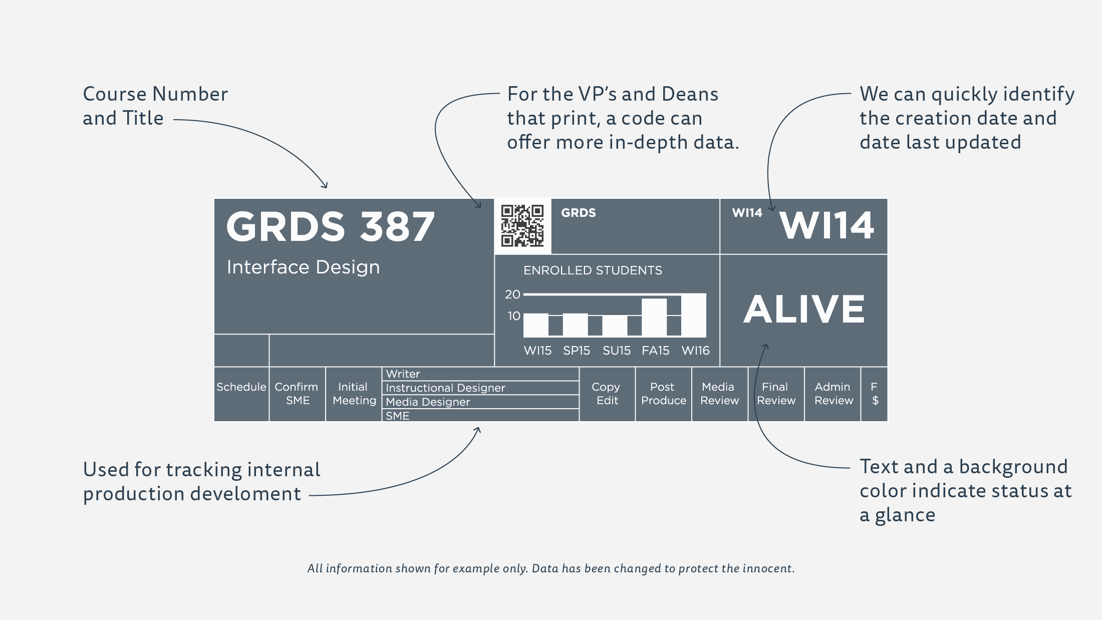
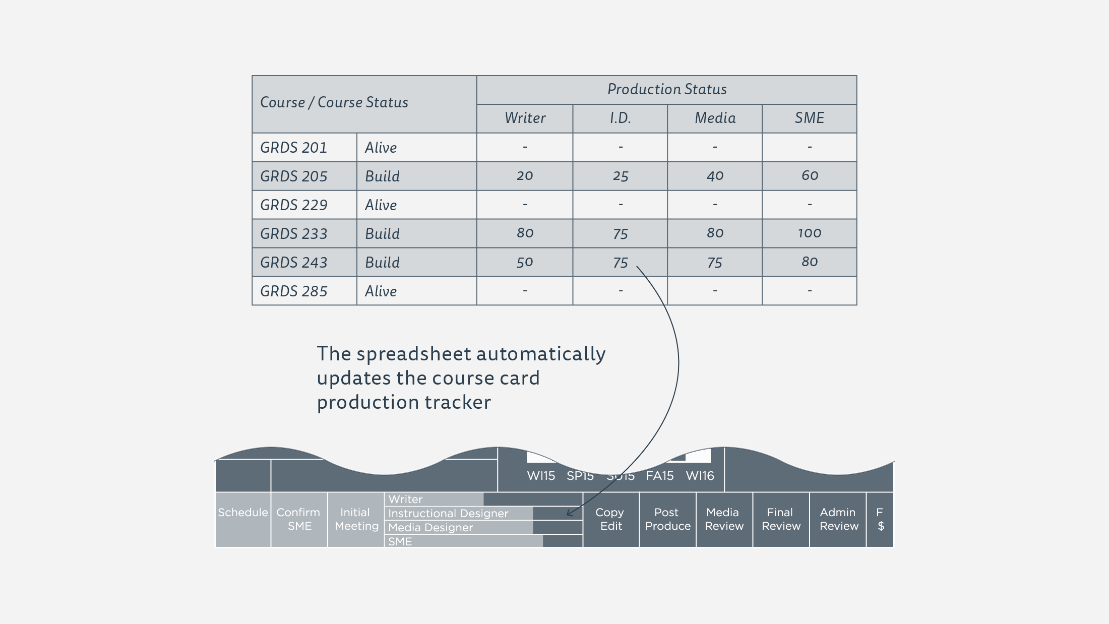
I wanted to make the system so easy to use that anyone with access to the spreadsheet could update the course cards.
A color coded system was developed to quickly identify priorities and current status.
Automation to the Rescue
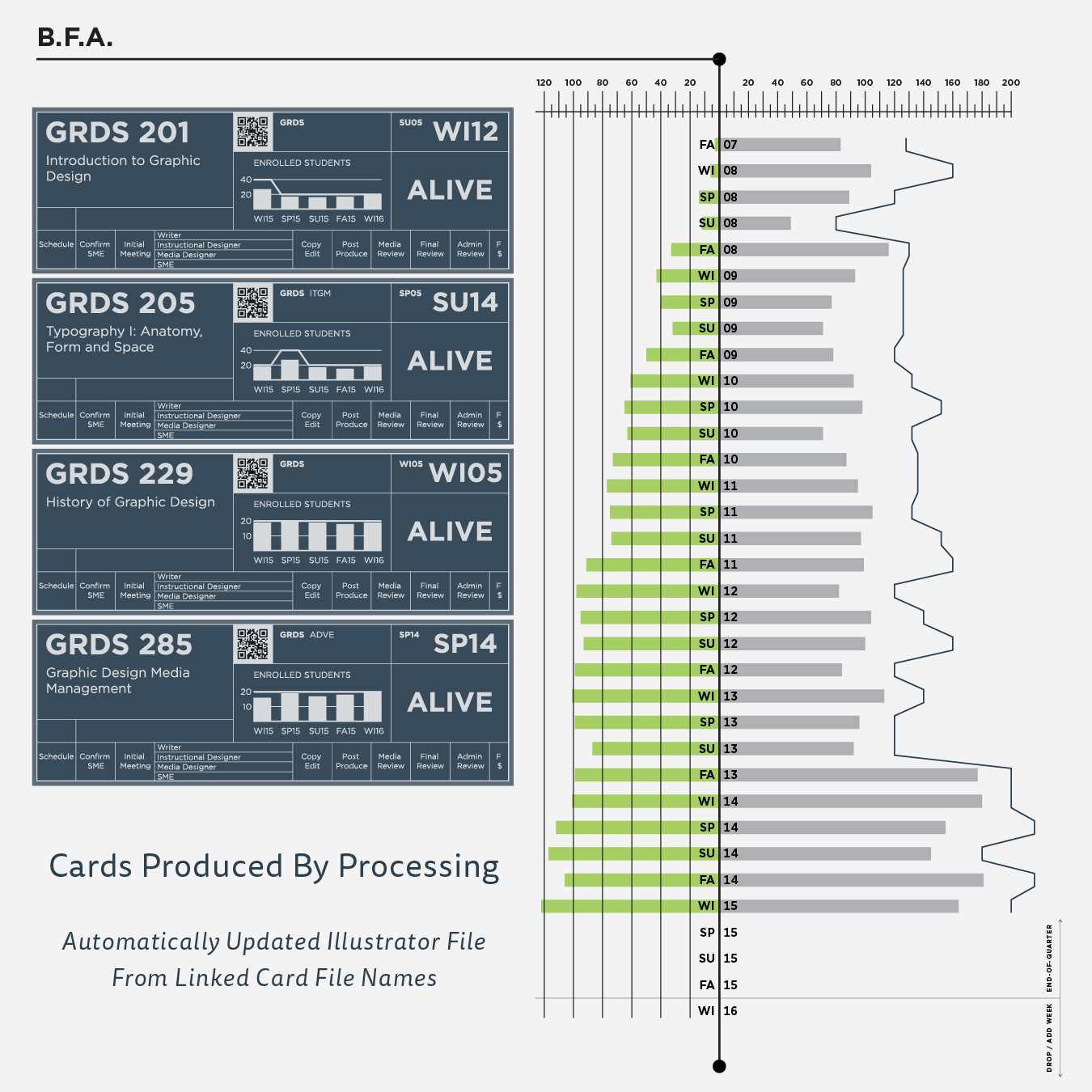
I wrote a second Processing program to visualize all the individual degree program data as well. From a forecasting and production planning perspective, this data was a game-changer.
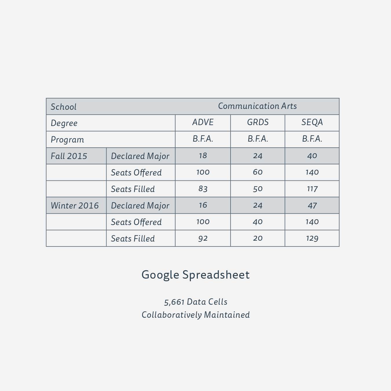
I love data and gaining insights from that information. Growing up I could have told you anything about baseball or basketball players because I would constantly analyze all the statistics that were printed on the back of their trading cards. Working with SCAD eLearning, I was able to apply those skills to help the department run smoother. I worked with the director to determine what data would allow him to best lead the department and make decisions about future programming easier. In addition, I worked with the assistant to the director to gather and sort the raw data from our internal system.
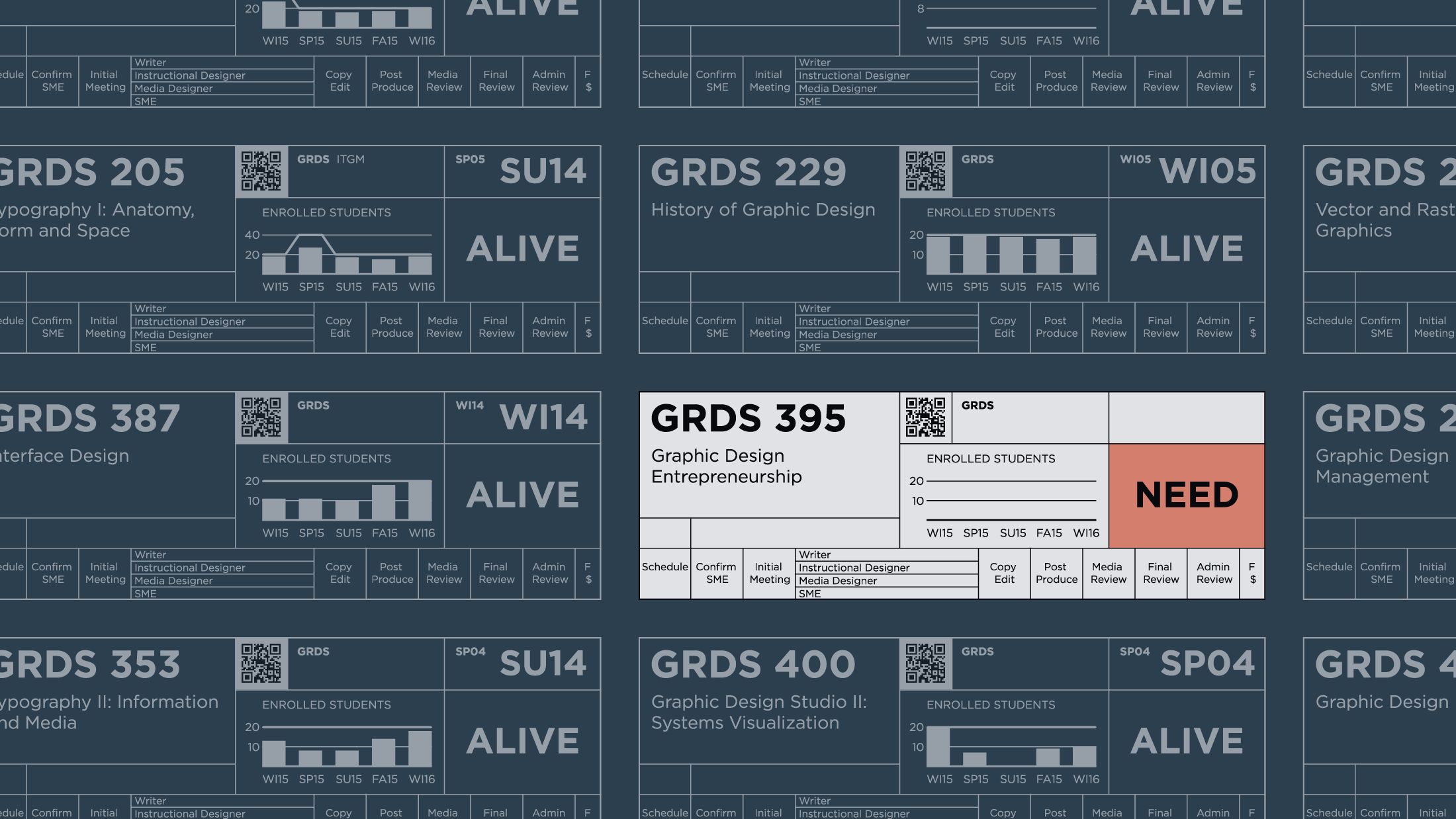
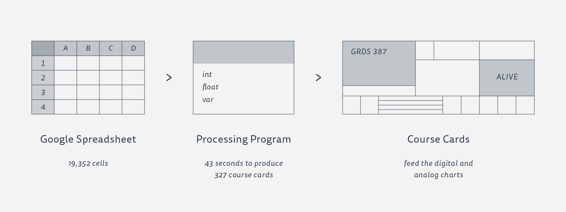
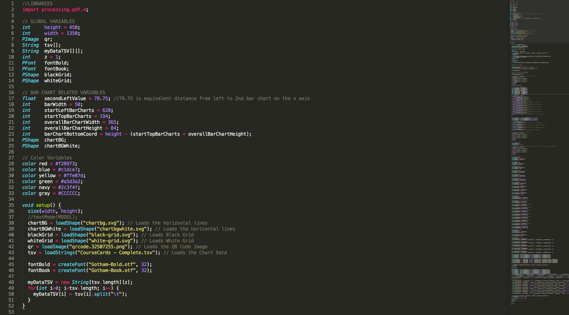
Once the data was organized, I worked with the director to determine the best mode of presentation. Since there are almost 400 courses in the system, a compact design would be necessary for the Deans who preferred to print their department’s data in poster form. Prioritizing what the primary and secondary data sets were, enabled us to display what was needed immediately, while offering an interactive solution for digging deeper when necessary. Since the data on the card would update every quarter, or even weekly if it was in production, I needed to develop an efficient system for generating them. After some experimenting, I found that my best option was to use the data crunching potentials in Processing. The information was already in table form, so I wrote a custom Processing program to grab that information and turn it into a visual representation of each course SCAD eLearning offers.
Classification
Data Visualization
Client
SCAD eLearning
Typefaces
Gotham Bold and Book
Production
Data Gathering > Google Spreadsheets > Custom Processing Program > Output to Digital Environment and Printable Production Map