Classification
Research, UX Design, UI Design, Prototyping, Design System
Client
Ricardo Beverly Hills while working at Gauge
Production
Sketch -> InVision
Live Site
Role — Research, UX Design, UI Design, Prototyping, Design System
Context
People travel for the experience. It starts the moment they pack their suitcases. It continues until they find themselves home again. Ricardo Beverly Hills is a company that takes that journey with you. They needed to reflect that experience for customers on their site.
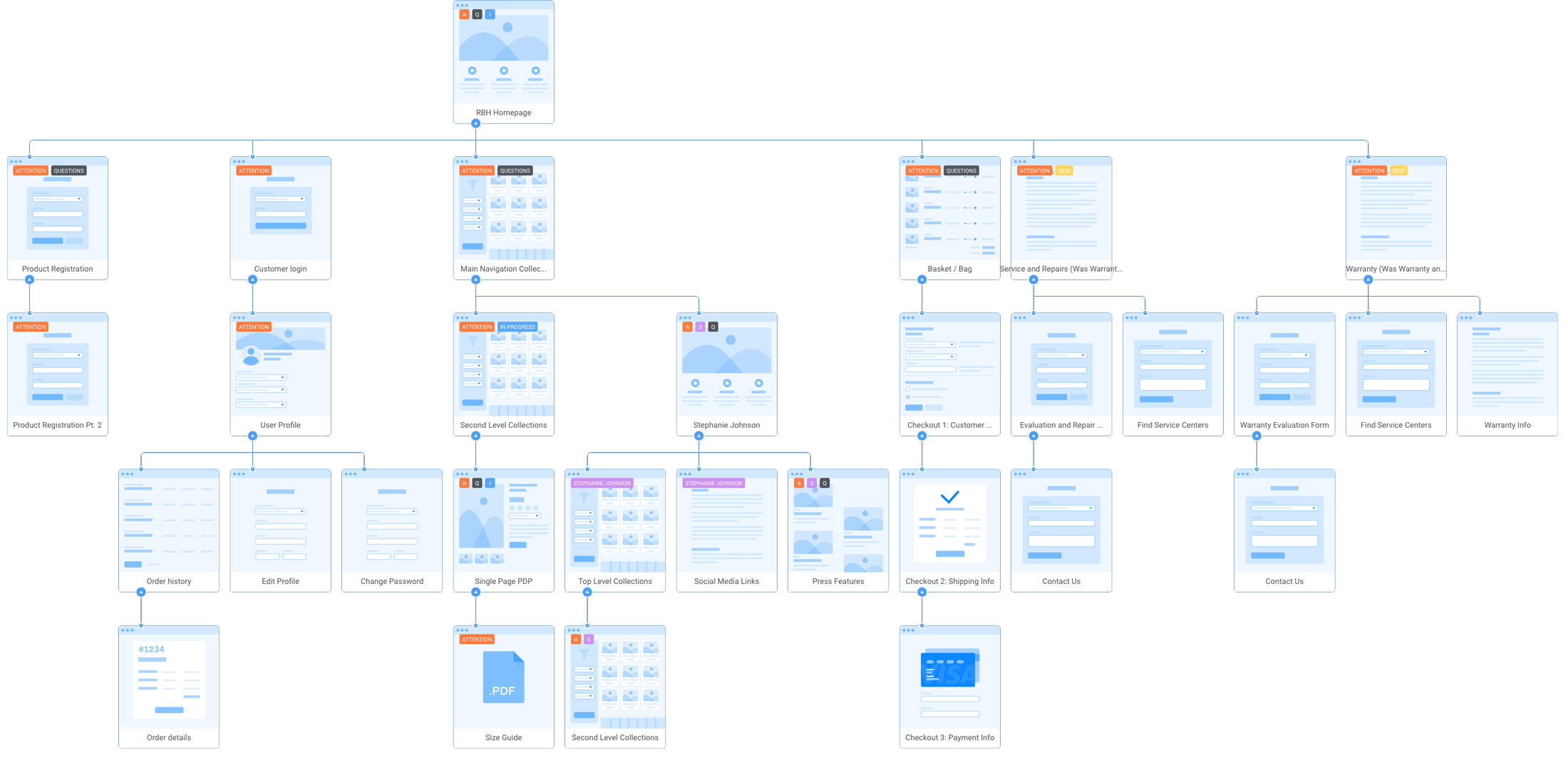
Ricardo Beverly Hills consists of three brands. We partnered with their team to create an immersive eCommerce experience that encompassed each brand under the Ricardo umbrella. We ultimately combined three brands into two Shopify storefronts so a sitemap was crucial.
Clean and Modern, Just Like Their Luggage
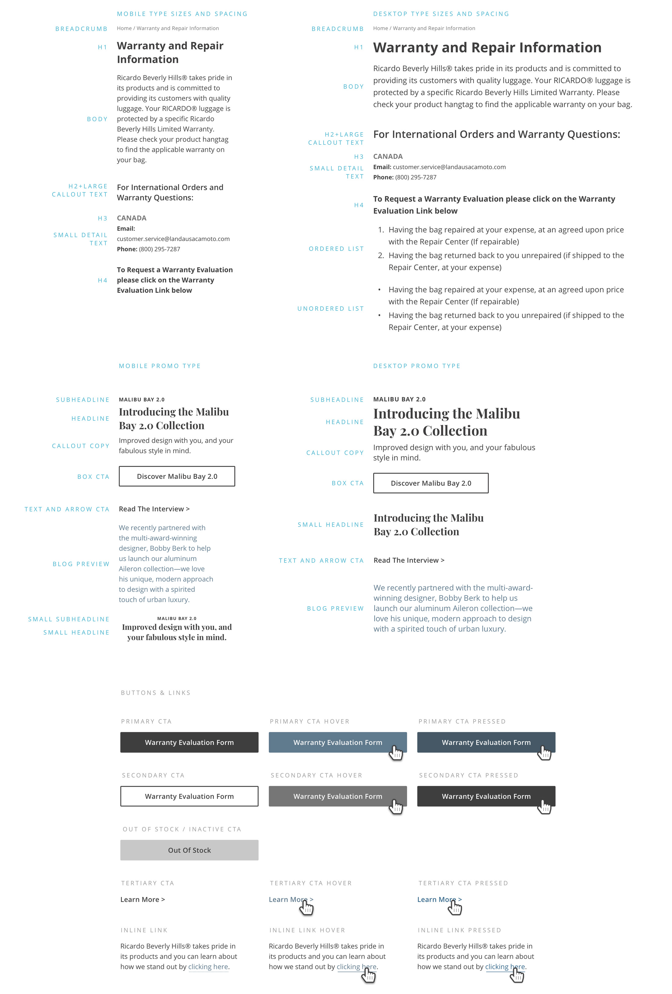
Two of the key project goals were to elevate the brand experience and establish a new typographic system. They wanted to stay within the offerings of Typekit or Google Fonts so I developed a series of typographic studies with their current content. We landing on Open Sans as their workhorse.
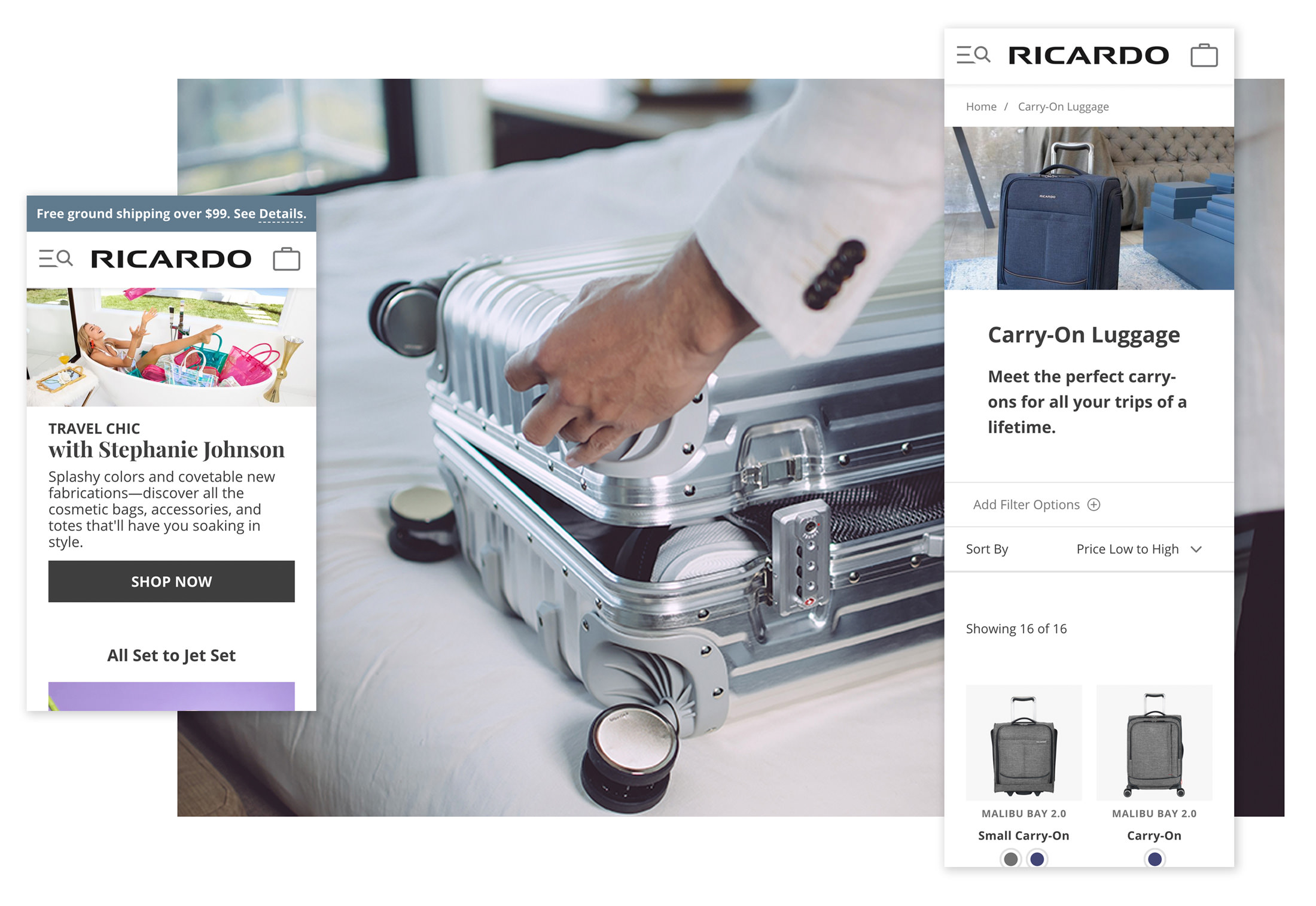
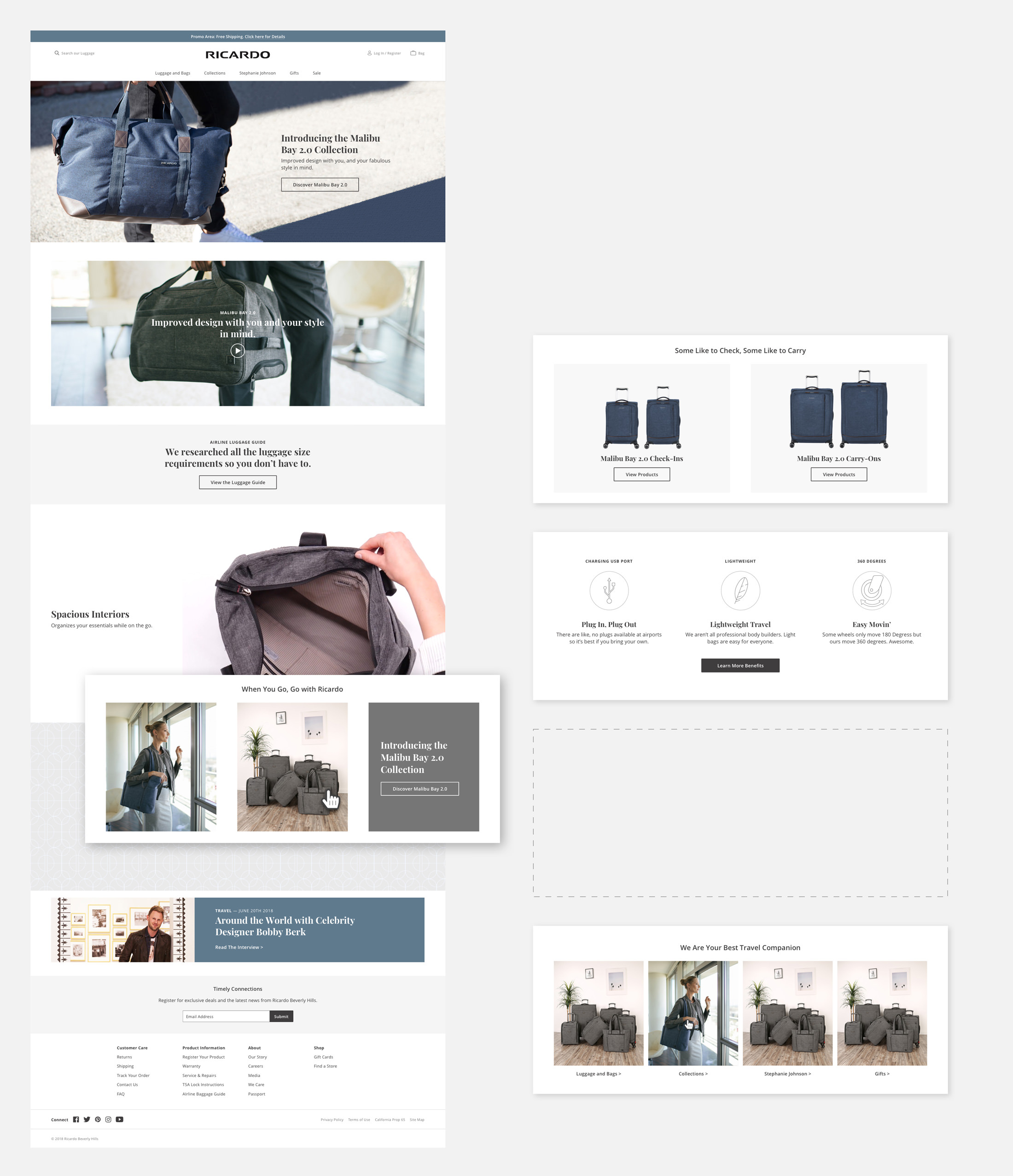
Customizable Sections
One of the benefits Shopify offers is its ease of use from the admin panel. Within its sectioning capabilities, we designed a robust system of options to give the Ricardo team the flexibility to tell their story as they wanted. They have a strong internal marketing team so giving them the keys to customize their site was a huge win.
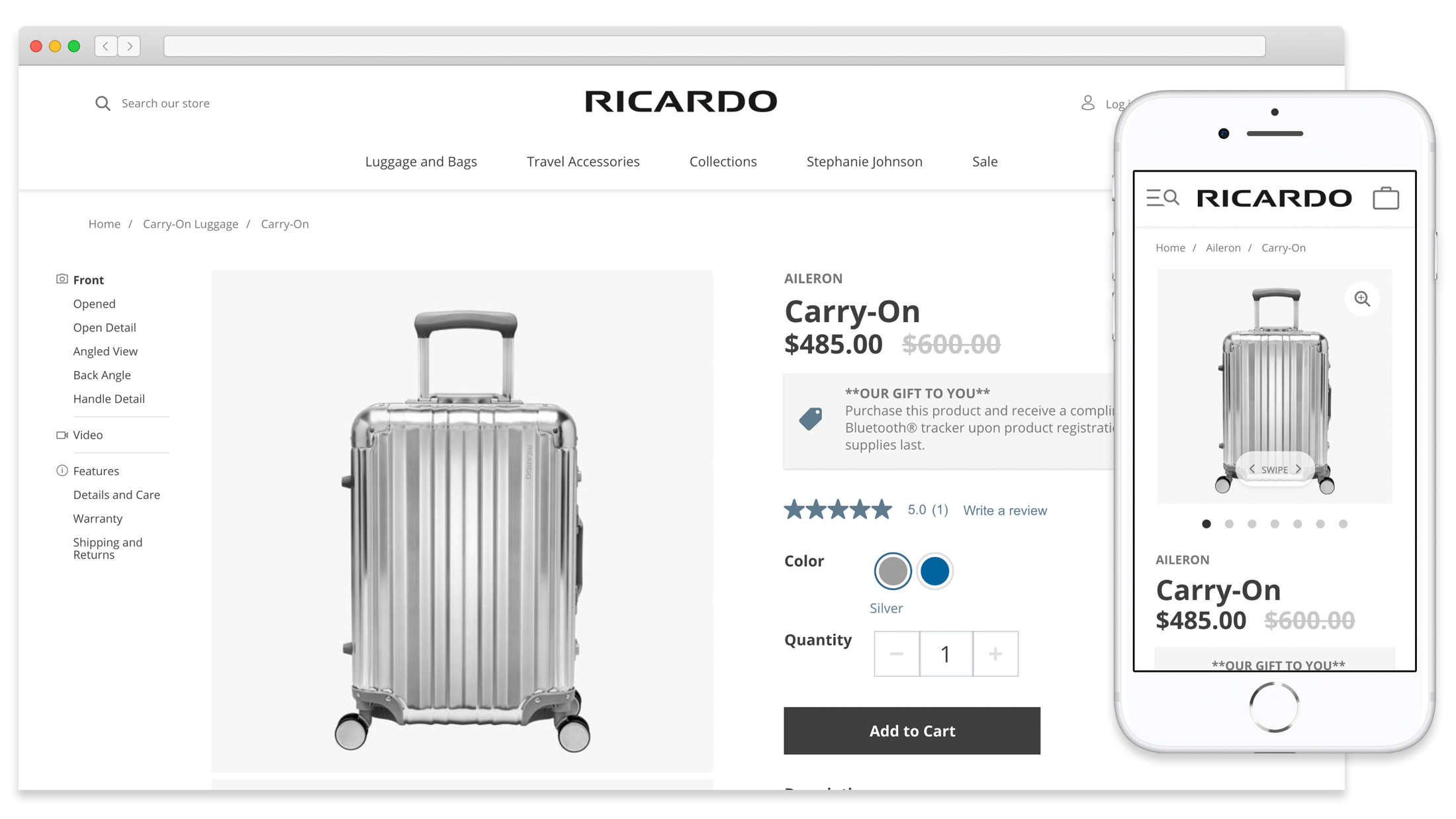
Descriptive Thumbnails
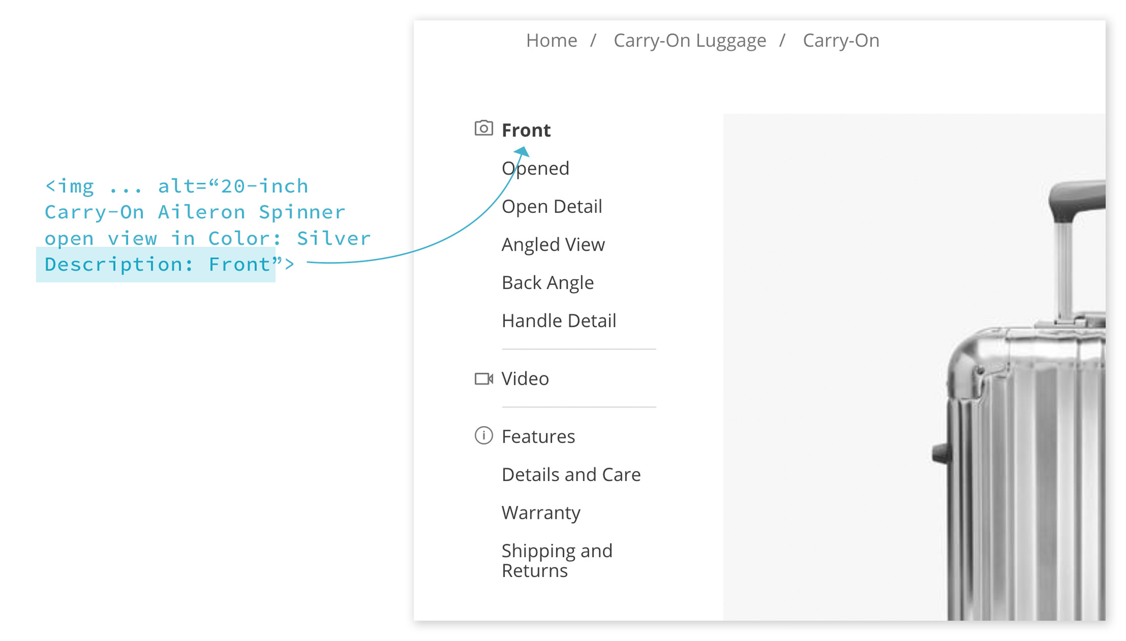
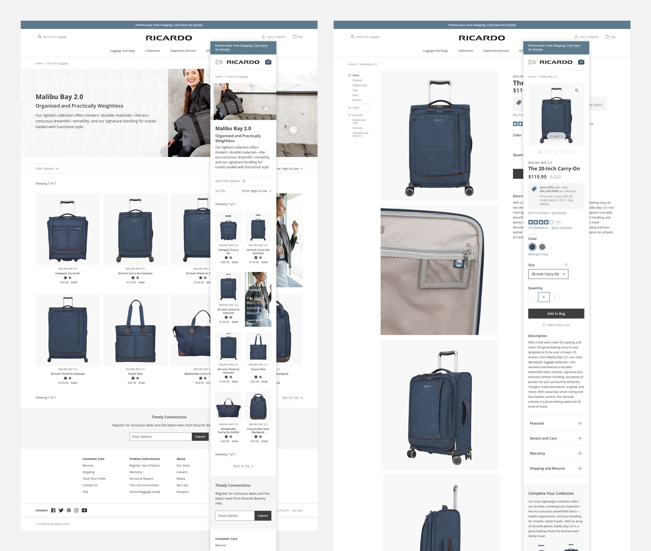
Luggage images at tiny scales degrade into colorful rectangles. I worked with our developers to make the default Shopify thumbnails more useful for the customer. We designed a simple alt tag system for the client that pulled in a snippet of the image description to replace the default Shopify thumbnail image. That way the customer can quickly see what views are possible. By clicking on the text thumbnail, the page scrolled the user to that view.
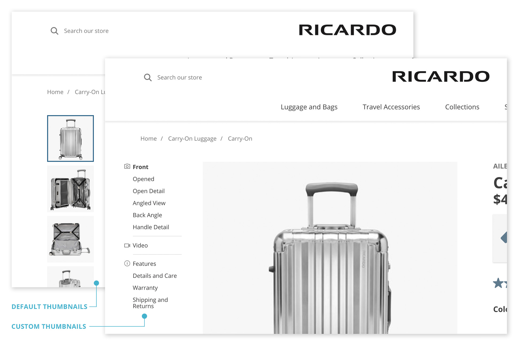
Since this system was a new way of generating product pages, it had to be simple. The client already writes the alt tags. We added the functionality in that attribute to double as screen reader content and a thumbnail replacement. The alternative way would be to add a separate custom meta field, doubling the areas of input and time.
Capitalizing on Internal Talent
Ricardo Beverly Hills has an amazing internal photo and video team. To highlight their skillset, we reserved space on the product page for a video showing the luggage in use. Luggage is a product that generally requires research. When a customer can visualize themselves with their product the chances of them aspiring to have it increase.
Wide Open Spaces
The client wanted to maximize the amount of horizontal real estate to show off their beautiful luggage. With that goal in mind, we developed a horizontal filtering system to allow easy product discovery while letting the images take center stage.
The Complete Journey
The final design gave the client the ability to add the storytelling they wanted to. It also helped engage their audience in a way that matched the exceptional experience they have when traveling with Ricardo Beverly Hills luggage.
Classification
Research, UX Design, UI Design, Prototyping, Design System
Client
Ricardo Beverly Hills while working at Gauge
Production
Sketch -> InVision
Live Site