Classification
Research, UX Design, UI Design, Prototyping, Design System
Client
Cheap Joe's Art Stuff while working at Gauge
Production
Sketch -> InVision, InVision Studio Prototyping
Live Site
Role — Research, UX Design, UI Design, Prototyping, Design System
Context
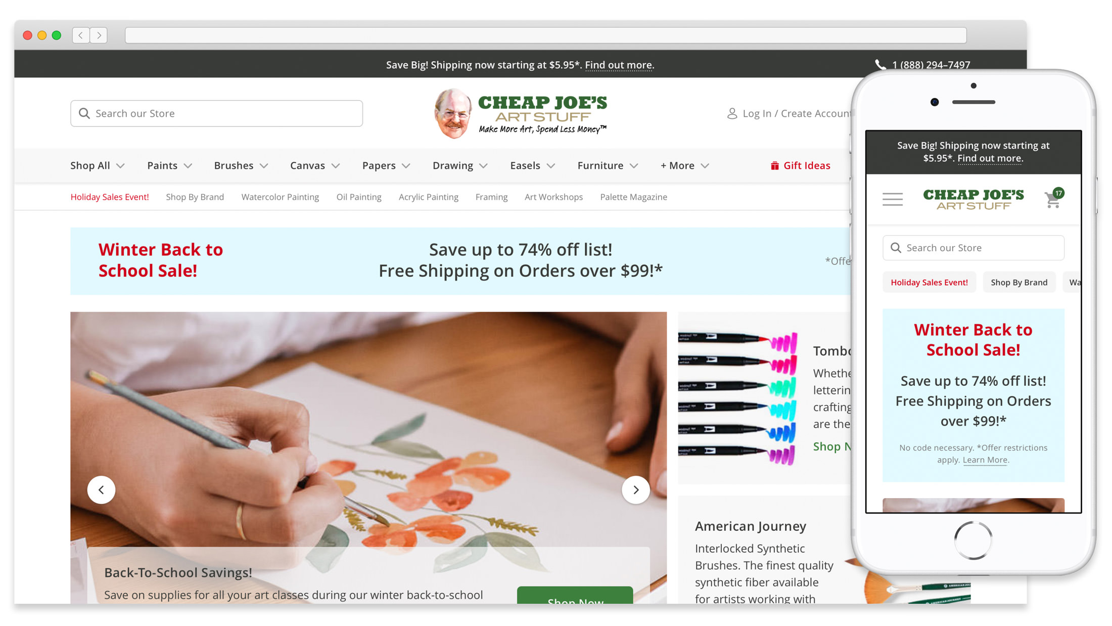
Joe Miller was a pharmacist who had a talent for watercolor painting. He wanted to make quality products available to everyone in Boone, North Carolina so he sourced them himself. He put up a sign in the pharmacy reading “Cheap Joe’s Art Stuff.” His hobby outgrew the drug store so he decided it was time to bring Cheap Joe’s Art Stuff to the masses. The Cheap Joe’s team had a website but it wasn’t easy to update or mobile-friendly. While working at Gauge, I helped them launch a site that is easy for their customers to use.
Optimizing Content for Mobile
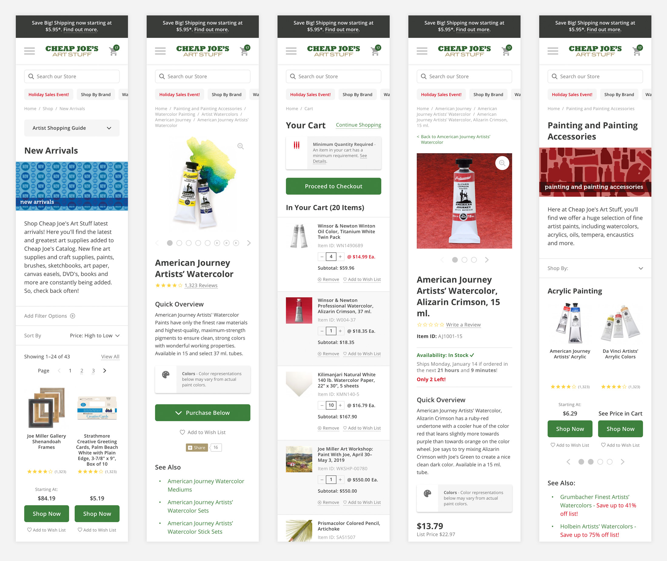
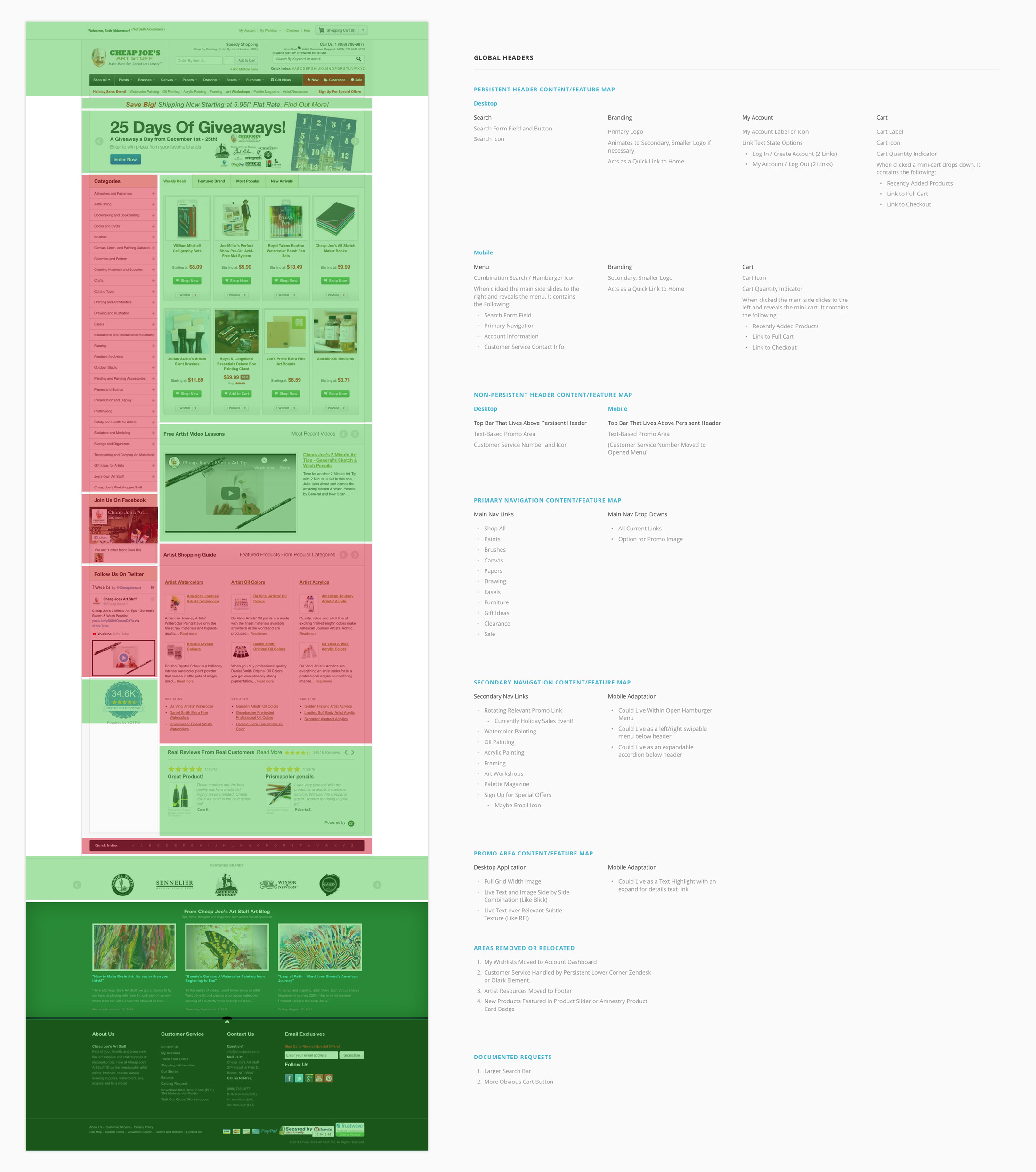
Over the years, the content on the Cheap Joe’s website had expanded to include anything they found customers needed. They didn’t have a mobile site so visitors had to use the pinch and zoom method to navigate on their phones. The adaptation to mobile helped us refocus on what content was important on each page so that it would display nicely from small to large screens. I like to use a Green, Yellow, and Red system to help us visualize what we will keep, move, or remove from existing pages. This helps us organize what we need for wireframes moving forward.
Bringing in Joe’s Personality
One of the great parts about the start of Cheap Joe’s Art Stuff was the relationship between Joe and his customers. He always had a story or quote to share with them. They grew to love him as much as his products. We wanted to bring that into the site so we added a Joe’s Quotes section to the home page.
Quick Links at the Ready
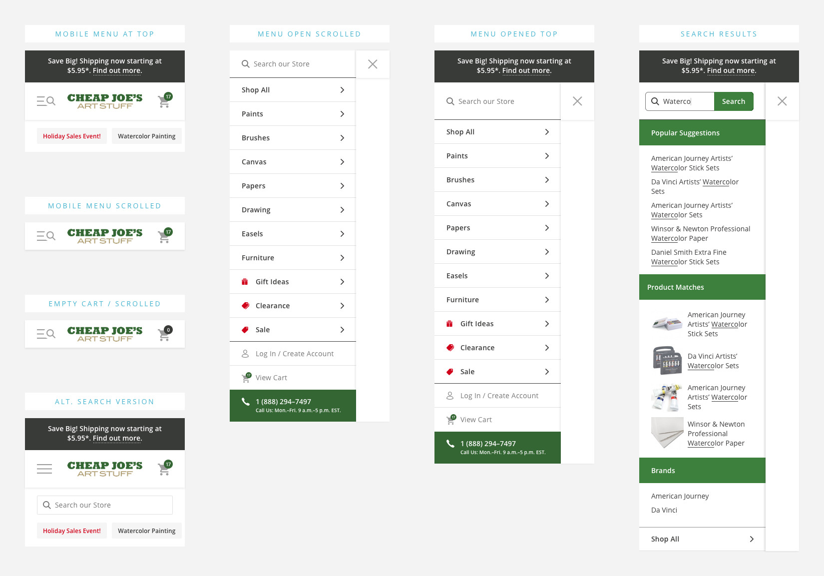
Cheap Joe’s had a lot of navigation links. We narrowed them down into two categories. All product offerings would live in the main navigation area. Promotional and popular product links would live in a swipeable secondary navigation area. To avoid taking up so much space with large promotional areas on mobile, we designed a swipeable system below the main header. This allowed easy access to areas on the site customers visited most.
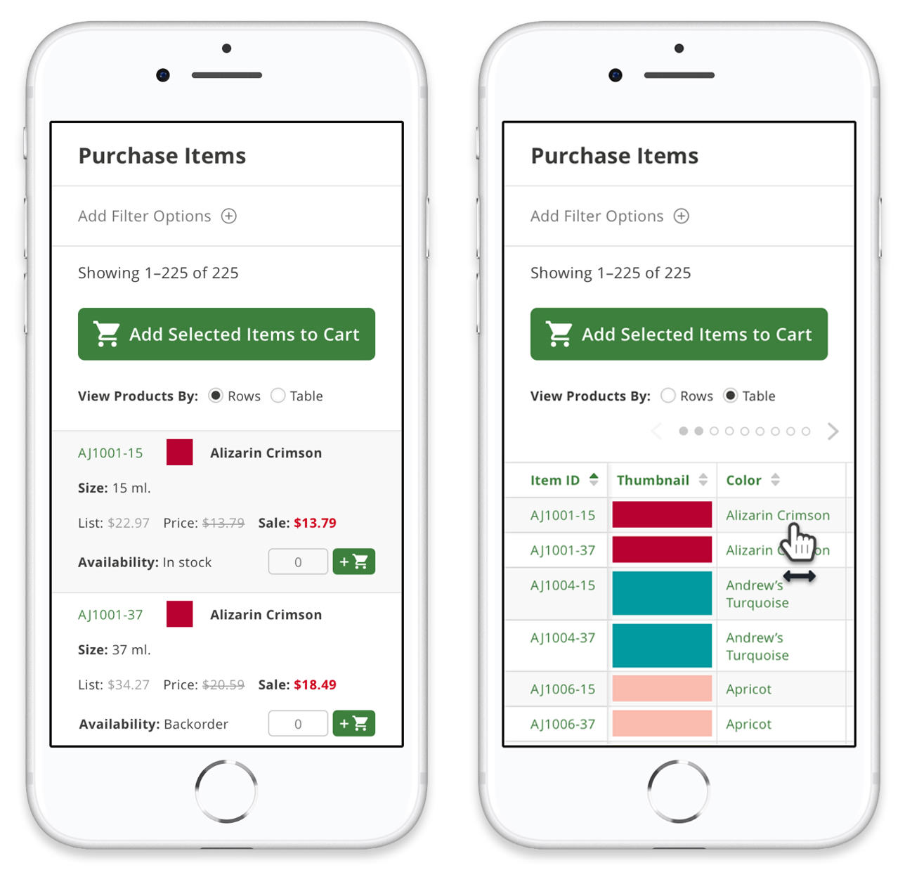
User Focused Product Discovery
Art supplies tend to have a lot of variants within certain products. Take their watercolor paints for instance. One brand has over 250 variants of color and size. We developed a filtering system so that on mobile screens, a customer could narrow down options and help them find the paint they were looking for. We also added the functionality to allow a customer to view the options as columns or rows depending on how much detail they needed to see at one time.
Icon System with a Varied Scale
Art supply stores need the ability to show certain icons throughout the site. Since they deal with chemicals, they are required to make it clear to customers that certain products could be hazardous. To extend this rule, we developed a scaling system so that these icons could be displayed in various locations throughout the site in a format that was useful to the customer.
Classification
Research, UX Design, UI Design, Prototyping, Design System
Client
Cheap Joe's Art Stuff while working at Gauge
Production
Sketch -> InVision, InVision Studio Prototyping
Live Site