My goals for the website redesign:
- Cleaner, More Mature Layout
- Smarter, Cleaner Code
- Projects: Quality over Quantity
- Use SCSS (SASS)
- Diverse Project Documentation
- Easier to Update
- Improved Typography
- High Image Quality
Process, UI / UX Design
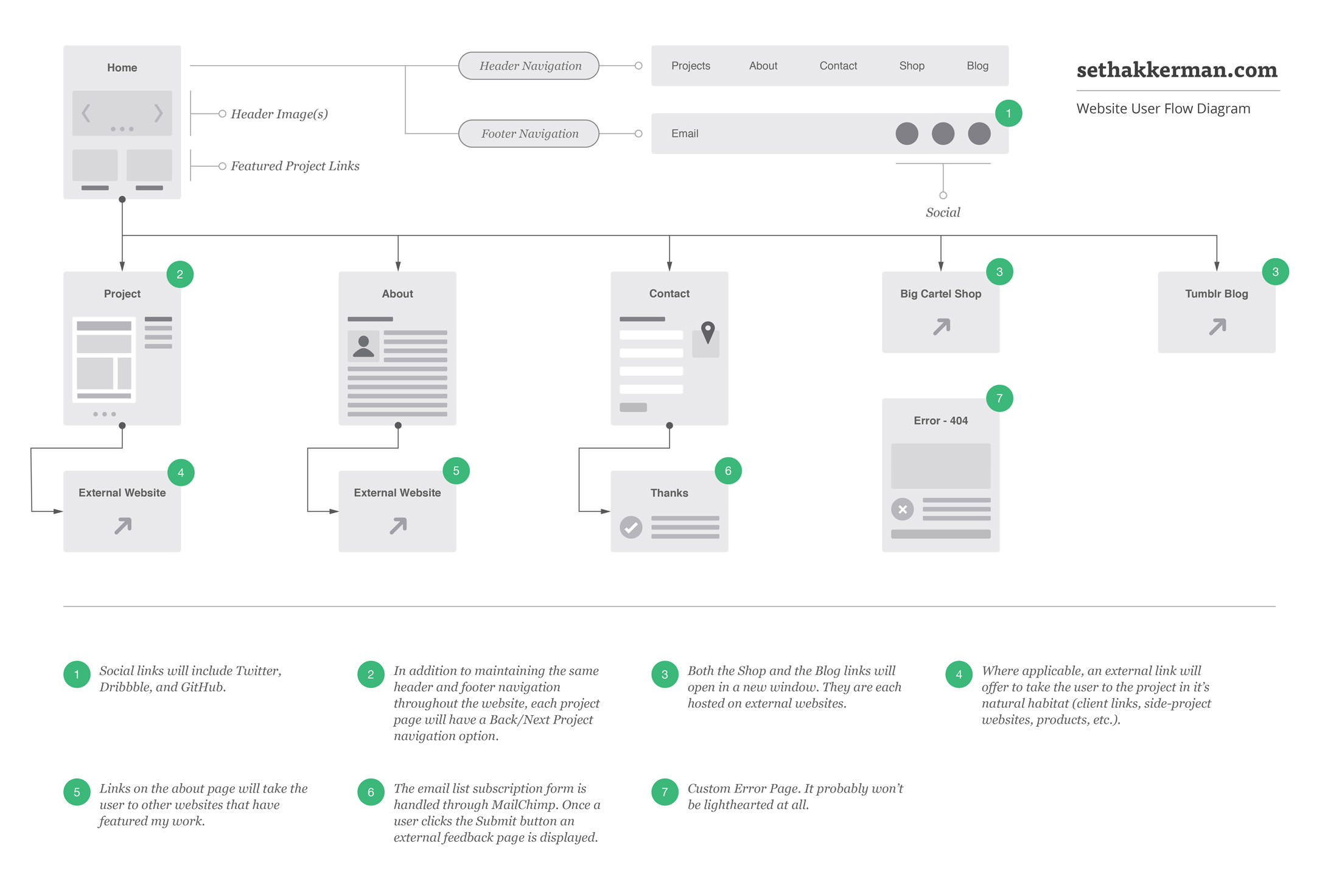
The main reason for the redesign was to move my portfolio website from pseudosuede.com to sethakkerman.com. It was time. People had trouble spelling it. I had been keeping written and sketched ideas for a while and wanted to work on my process instead of going from sketches straight to code. My first step was to create this basic user flow diagram. That way I could resolve as many potential roadblocks as I could discover early on in the process and really define what I wanted my new website to be.
My goals for the website redesign:
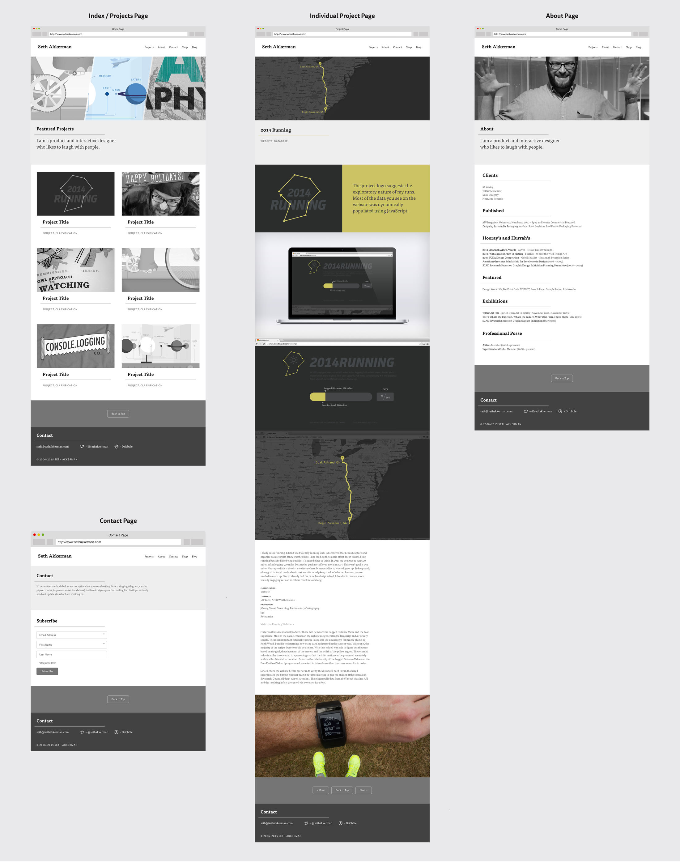
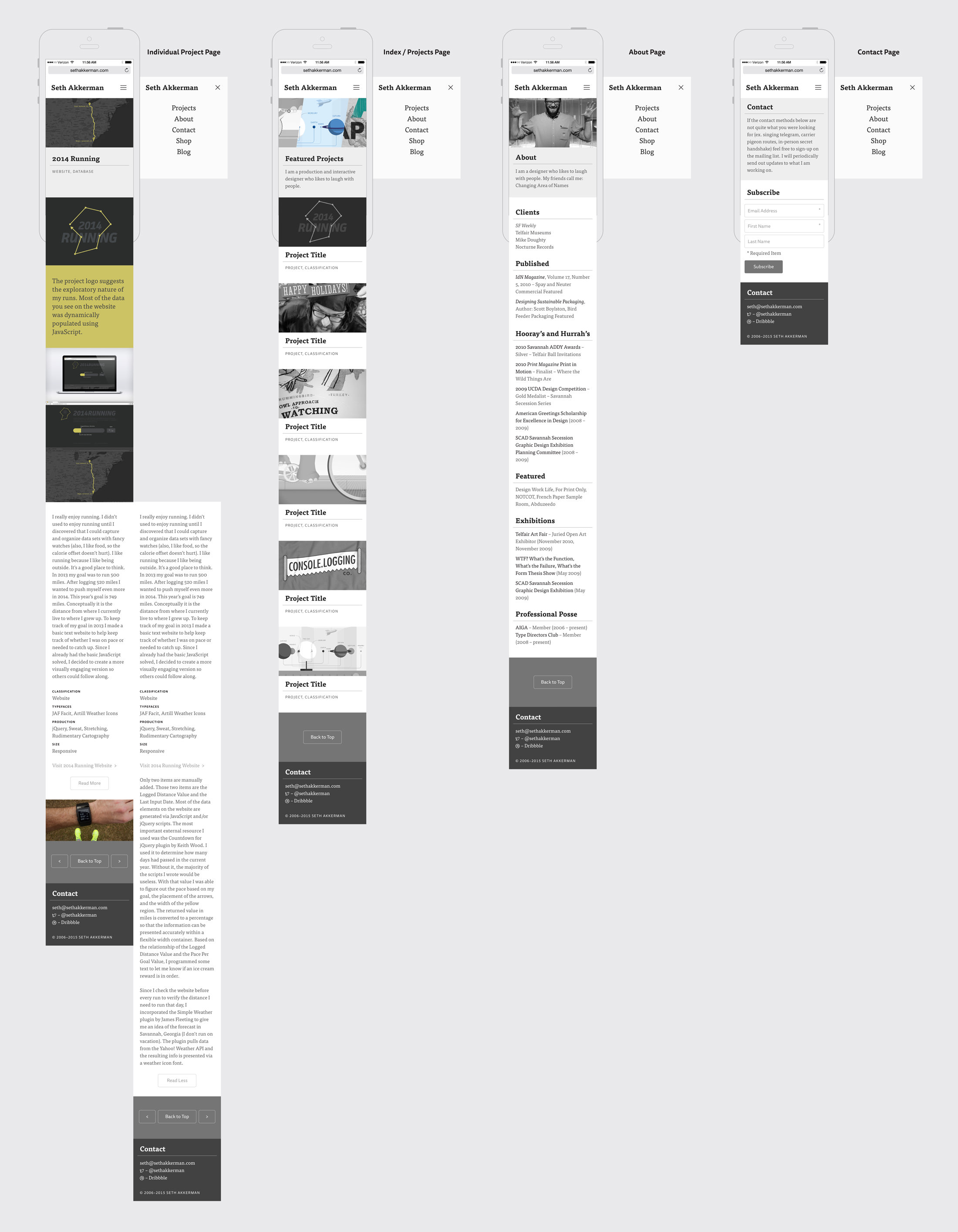
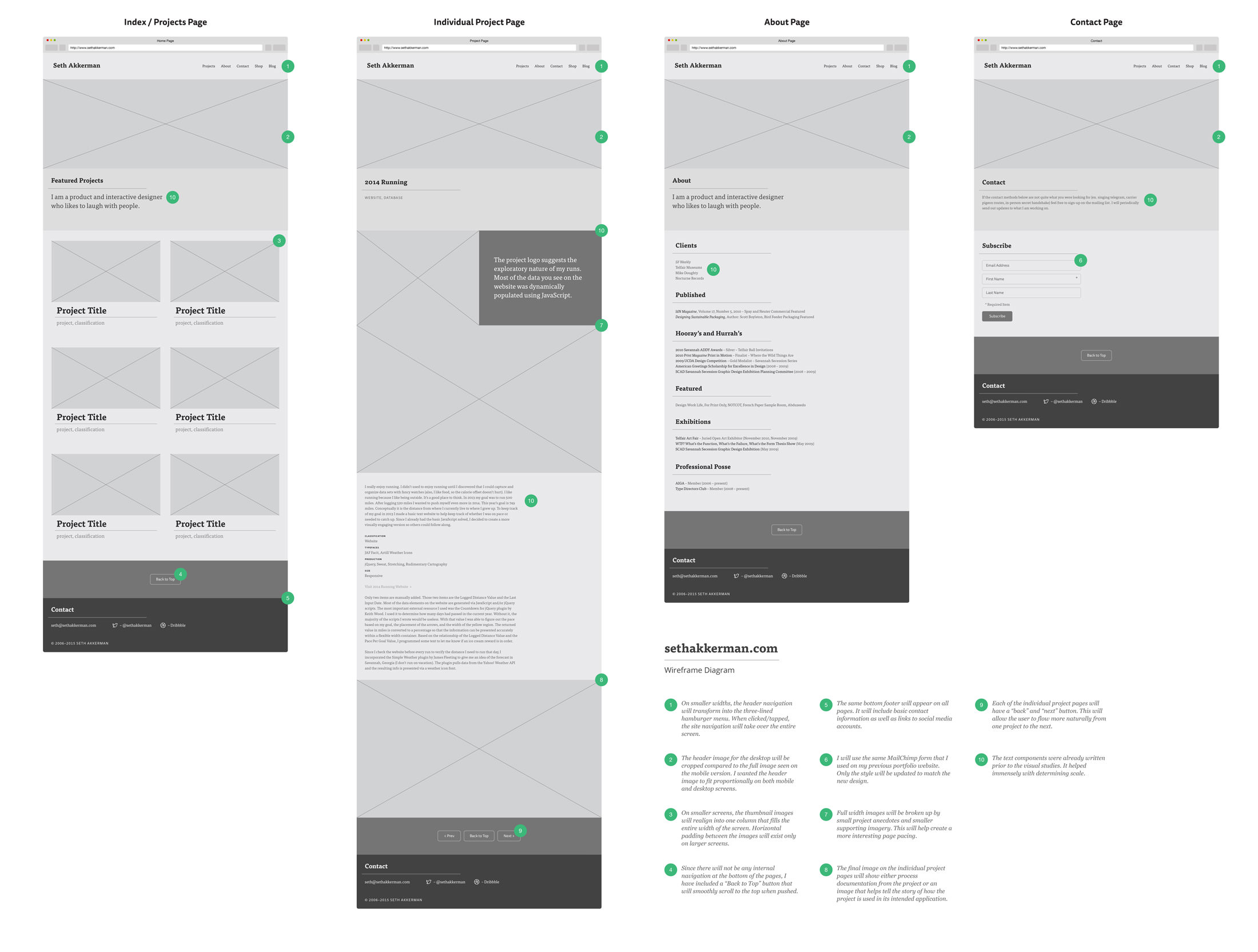
Once I finished the User Flow Diagram, I began working on the Wireframe Diagram for sethakkerman.com. The text components were already written prior to the visual studies so I was able to use actual words instead of lorem ipsum or representational lines. It helped immensely with determining scale.
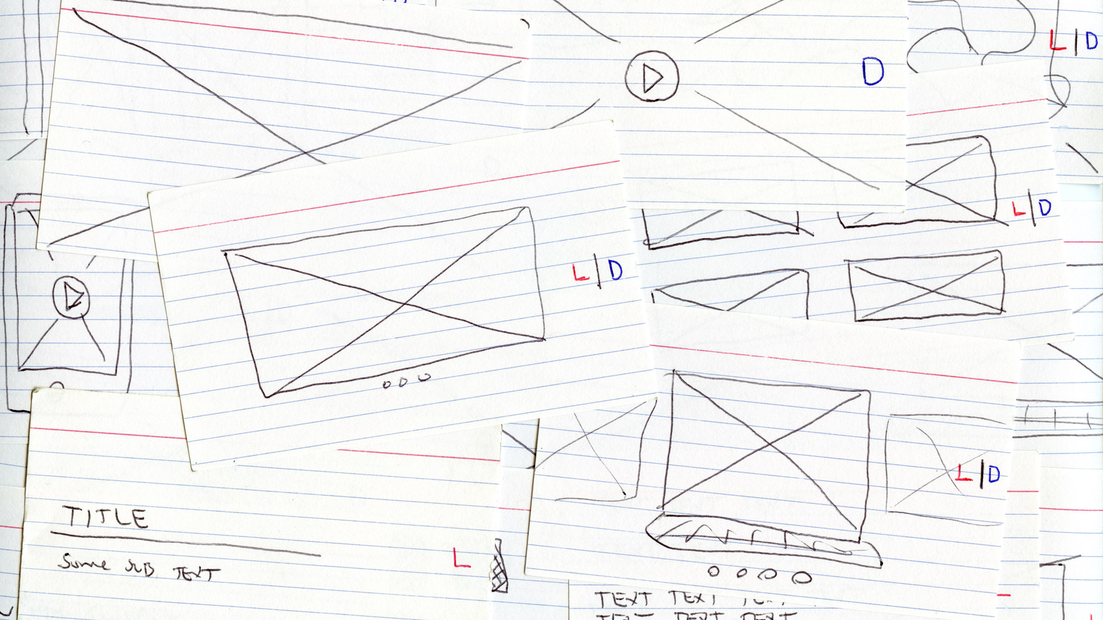
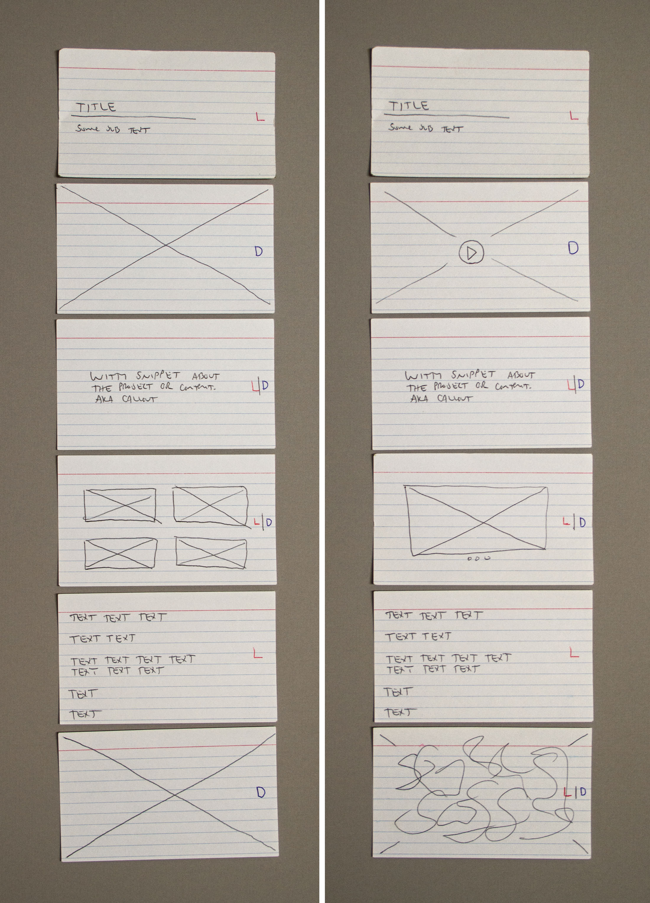
Prior to creating this digital version I used note cards with potential content blocks drawn on them to generate quick paper prototypes of my intended wireframe. For me, this method is faster than both sketching and digital mockups and is a task that can be completed anywhere.
I have been experimenting with using the Invision App platform for prototyping the refined wireframe I designed in Adobe Illustrator. After I exported the necessary still images it only took me about ten minutes from the time I signed up to create what you see above.
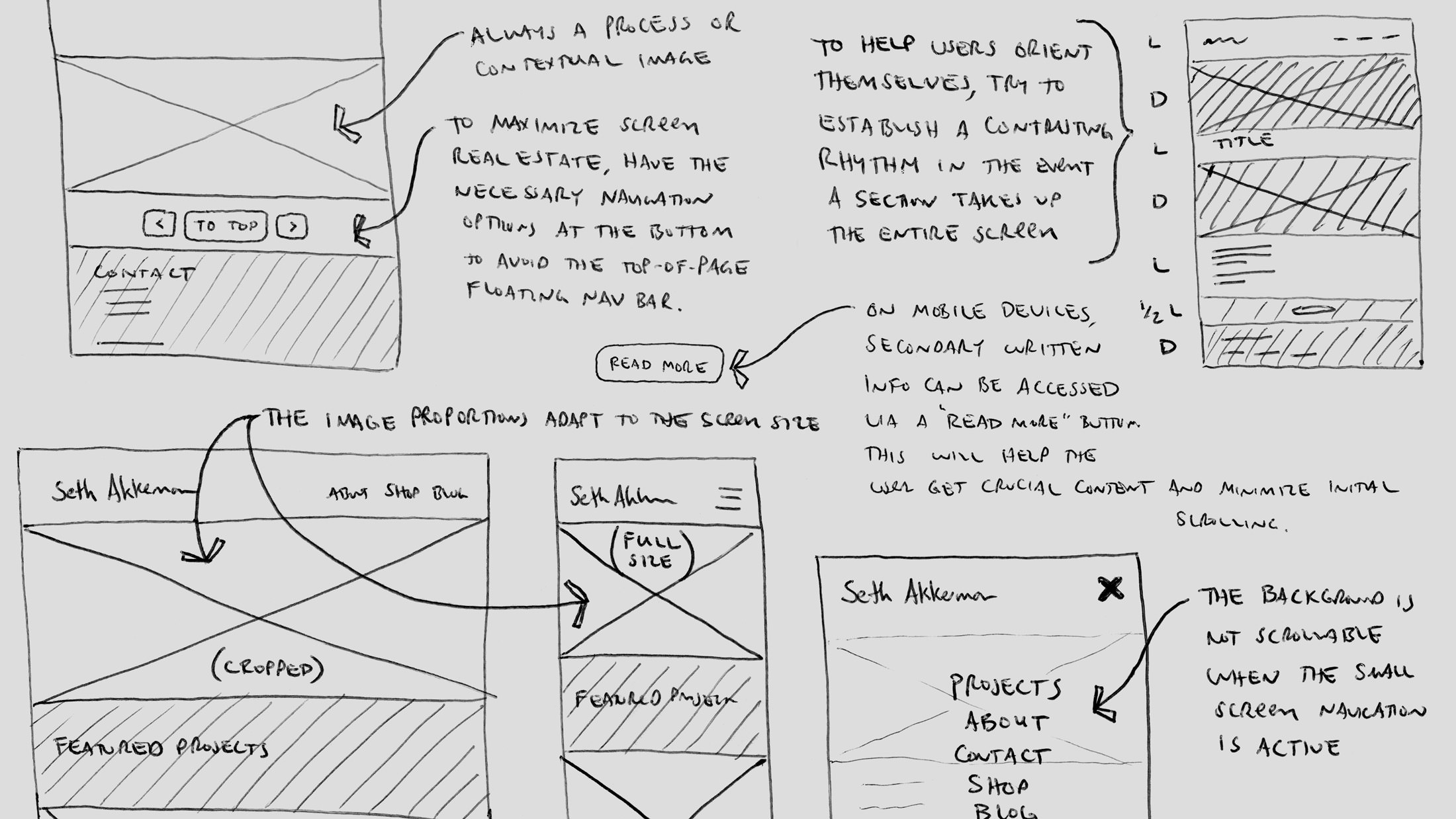
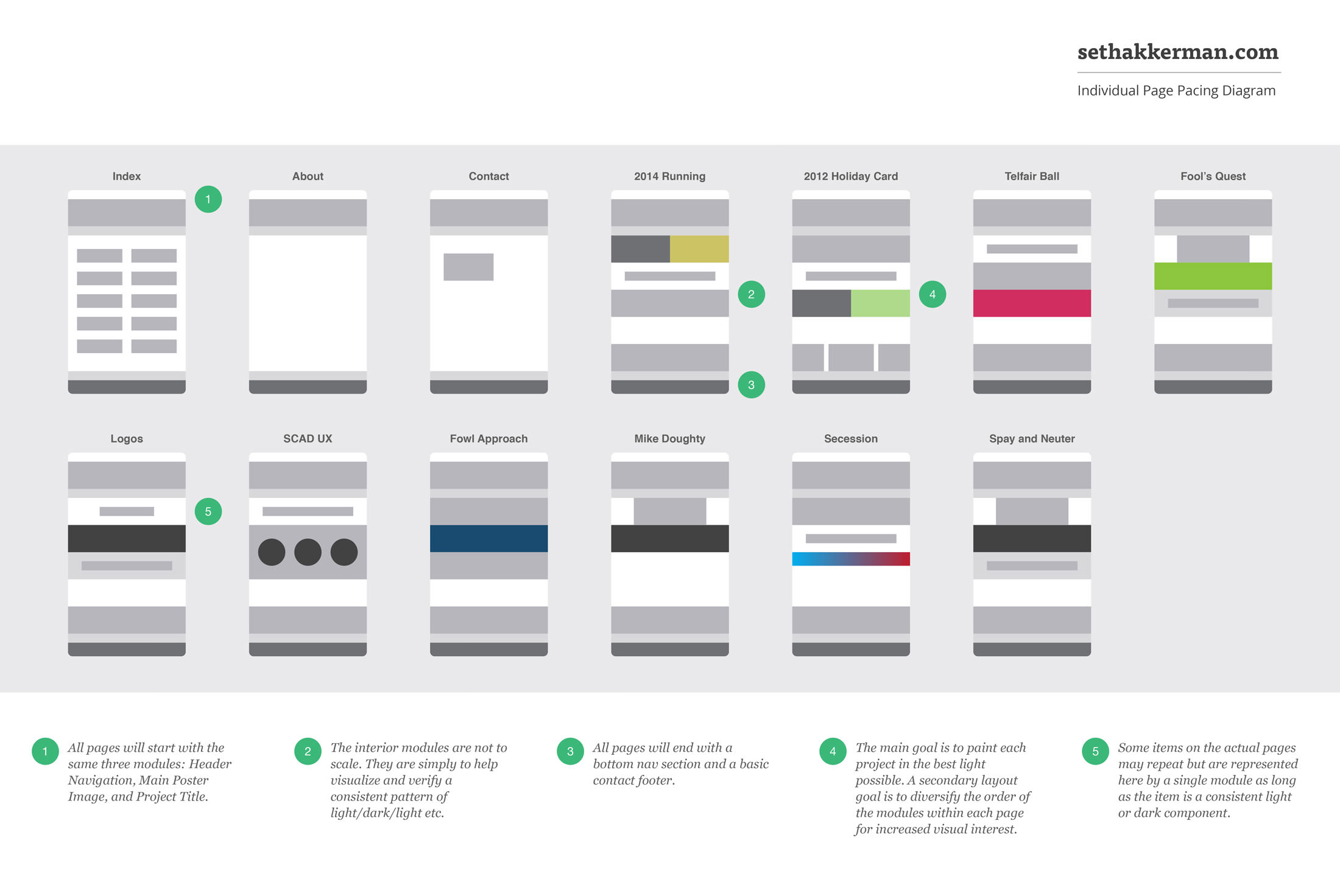
Since the new sethakkerman.com layout relies on full-width images and text blocks, it was important to me the page still maintained a balanced flow. Depending on a user’s device, some images could potentially take over the entire screen. As they scrolled down the page, I didn’t want the user to become lost within a series of dark / dark / dark or light / light / light images. To avoid this, I made a conscious effort to present the work using contrasting content modules. This helped me establish some secondary design conditions, supporting the overall goal of using high-quality images to communicate the most important aspect of each project.
After the wireframe and page flow diagrams were complete, I created a hi-fidelity Photoshop mock-up for sethakkerman.com. It helped me sort out final image dimensions and proportions. I keep a database of all current portfolio images handy so placing those was as easy as placing the pre-written text in the wireframe diagram.